|
|
||||||
| "A very useful addition to the business writing literature. Without having to become a graphic designer, I learned all kinds of helpful ways to organize ideas, layout, visual cues, and to use the normal options of a word processor, to make what I write look better and convey its message more effectively." --Richard Schram, Director, Goddard Business Institute "Make room on your shelf between Webster's and Strunk and White. In thirty-six straightforward principles, Soden gives the rest of us the means to design effective, persuasive documents. Well-written, engaging, fun to read, jam-packed with helpful information." --Anthony R. Pratkanis, coauthor, Age of Propaganda: The Everyday Use and Abuse of Persuasion |
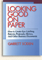
 Looking Good on Paper How to Create Eye-Catching Reports, Proposals, Memos, and Other Business Documents Published by AMACOM, American Management Association | 1995; 123 pages; ISBN 0-8144-7858-1 | $16.95US; Paperback UNLIKE VIRTUALLY ALL OTHER BOOKS ABOUT GRAPHICS, Soden's Looking Good on Paper doesn't teach design as a way to enhance a publication's aesthetic appeal, but as a practical method for improving the effectiveness of everyday business communication. The genesis of the book came from Soden's own experience as a designer. During his time as Art Director for Occidental College, Soden had found that his interns, although typically art majors, had never been taught the principles of publication design that directly influence communication; principles that working designers learned through apprenticeship or culled from technical books on typography and printing. Research revealed that there existed no book that concisely summarized these principles, and so Soden found he had to teach them anew every year. With the advent of desktop publishing and word processors, Soden realized that the principles he taught could be used as a powerful set of guidelines to improve business documents. He chose as his model a paragon of clarity, Strunk and White's Elements of Style. Similar to the way Elements codifies the principles of effective composition, Looking Good on Paper distills the basics of visual communication into 36 straightforward commandments. Also like Elements, Soden's book provides both general prescriptions and specific rules. The key to Soden's general instruction is his concept of presenting readers with a "Hierarchy of Attention." Principles in this section include Show what deserves first attention, second attention, and so forth; Create only the number of visually distinct levels you need; Make similar items look similar; and Organize your material into simple shapes. Specific rules that ensure readability include Don't use several different fonts in one document; Set your font size and margins so that between thirty and ninety characters fit on each line; Don't justify narrow columns; and Reduce the letterspace, word space, and line space when you use larger fonts. The book also includes an introductory section that guides readers on how to approach putting a message in printed form, with principles such as Know your message, Know your audience, Choose an effective form, Aim for a response, and Put your taste in the background. Illustrations on nearly every page, including many "before and after" examples, show readers exactly how to apply the principles. An excerpt from Looking Good on Paper appeared in the professional journal Before and After, and the book was translated and published in Italy by the distinguished publisher FrancoAngeli. Click here to read an excerpt from Looking Good on Paper |
|||||
marketing | books | articles | biography | contact | home
Copyright © 2006 Garrett Soden